HVAC Website Design for Emergency Service Lead Capture
Phone speed trumps polish when a furnace dies at midnight.

Homeowners with a dead furnace at midnight don't compare quotes. They hire whoever answers first, and that single behavioral fact should decide almost every structural choice on an HVAC website. According to Marketing LTB's 2026 data, 52% of homeowners hire whichever company they reach first, full stop, no runner-up. Most HVAC sites still get this backwards: the phone number is the product, and the contact form is a consolation prize for a visitor having an entirely different kind of day.
That's not a design opinion, it's a math problem. Roughly 78% of homeowners research online before calling anyone (Marketing LTB, 2026), which means the website isn't sitting next to the sales conversation, it is the sales conversation, or at least the first ninety seconds of it. Emergency HVAC tickets run $800 to $2,500, full system replacements run $8,000 to $20,000, and missing a handful of calls a month to a slow, cluttered site is a direct revenue loss. It's a payroll problem, the kind that shows up quietly in a slow month and gets blamed on the economy instead of the homepage. Every section below gets judged against one question: does this get a stressed-out homeowner to a connected call faster, or does it just look nice while they wander off to the next name on the results page?
The two visitor types most HVAC sites fail to distinguish
Two people land on the same HVAC homepage and they are not having the same day. One has a dead furnace in January, or an AC unit that quit mid-July, and needs a phone number and a promise of speed within seconds of the page loading. That person is not comparing warranty terms or reading the About page. The other visitor is planning ahead, maybe pricing a heat pump swap for next spring, gathering three quotes over two weeks, perfectly happy to fill out a form and wait for a callback.
Most HVAC sites treat these two people identically: one generic "Contact Us" form, usually buried on a subpage nobody finds without hunting. Nopio's 2026 research calls this a structural failure rather than a design failure, and the distinction is worth sitting with. A design failure is an ugly button. A structural failure is building a house with no front door and hoping people find a window around back.
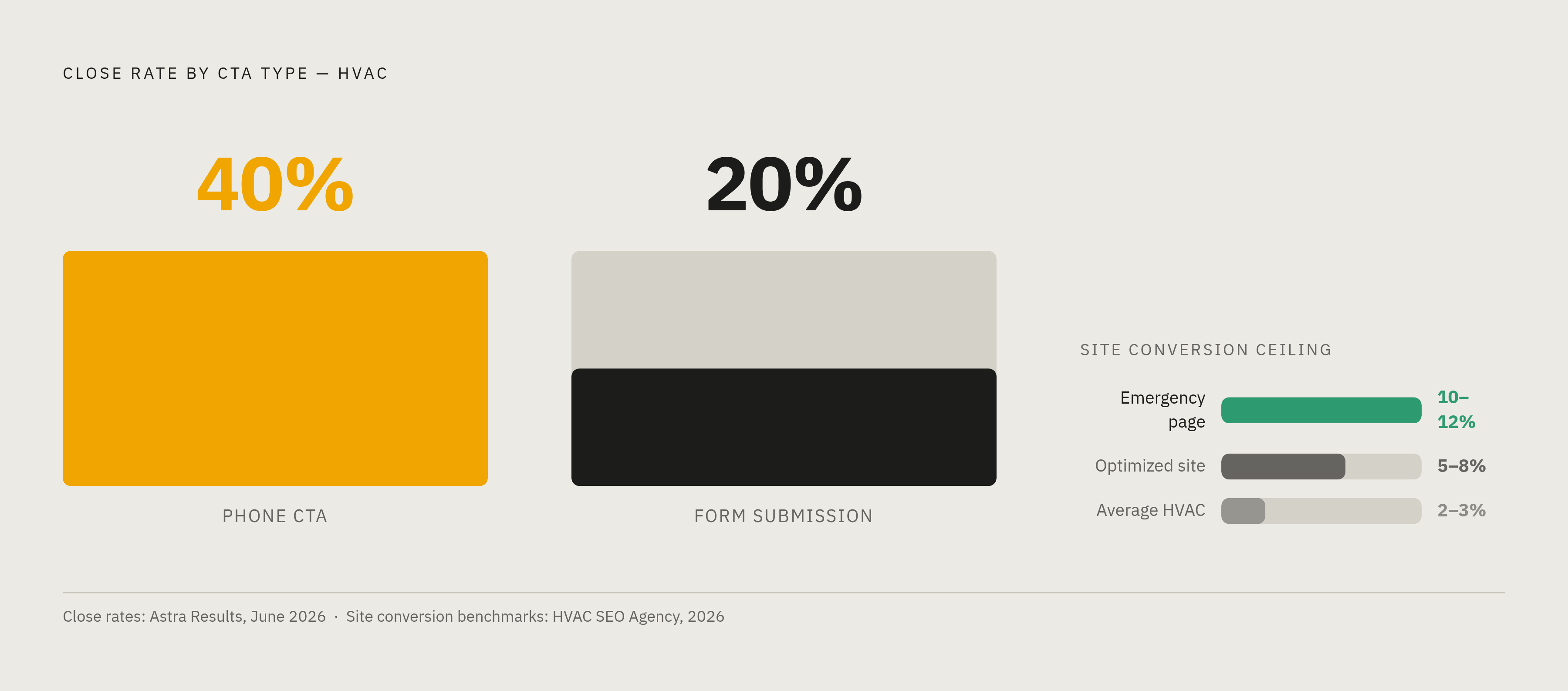
Phone-based calls-to-action close at around 40%, compared to 20% for form submissions, per Astra Results' June 2026 data. That gap alone settles the argument for emergency-intent traffic: phone has to be the primary CTA, not one option weighed evenly against a form. Average HVAC sites convert 2 to 3% of visitors overall. The best emergency-specific pages hit 10 to 12%, according to Web Tonic's 2026 benchmarks, because urgency shrinks the decision window down to almost nothing, and a site that respects that shrinkage wins the call.
So the fix reads simply on paper: tap-to-call front and center for anyone showing emergency intent, an online booking form as the secondary path for scheduled work (Nopio, 2026). Simple to state, apparently hard to build, given how many sites hedge with a form up top and bury the phone number in the footer like it's something to be a little embarrassed about. This split is the lens the rest of this piece keeps coming back to.
Why mobile performance is the non-negotiable starting point
Somewhere between 70 and 78% of HVAC searches happen on mobile in 2026, and for anything shaped like "furnace not working tonight," that number climbs past 85% (Astra Results, June 2026). That's a person standing in a house that's turned into a sauna, phone in one hand, sweat on the other, googling with the patience of someone who has none left to spare. Treating page speed as a nice-to-have, rather than the whole ballgame, is where most HVAC sites quietly lose the lead before the visitor ever sees the phone number.
Fast-loading HVAC sites convert 50% better, and the line in the sand, per Macro Digital Media, sits at under 2.5 seconds for Largest Contentful Paint. Separate research from wearetg.com puts the outer limit at 3 seconds on mobile before visitors start abandoning the page. Somewhere in that half-second gap is where a lead either gets captured or evaporates into the next search result.
What causes the slowdown, according to Nopio's 2026 research, is mostly self-inflicted: page builders like Divi or Elementor stacking up 200-plus render-blocking scripts, hero images nobody bothered to compress, shared hosting plans that fall over the moment traffic spikes on the hottest day of summer. None of that is exotic. It's neglect wearing a template, and the fix is almost always subtraction rather than addition: fewer scripts, smaller images, hosting that doesn't buckle in July.
One Phoenix HVAC contractor rebuilt with a mobile-first approach in March 2025 and watched mobile conversion climb from 1.8% to 4.2% within 90 days, generating an additional $47,000 in revenue off a $2,100 website investment (HVAC Software Hub, 2026). That's not a rounding error, that's a $2,100 line item paying for itself more than twenty times over. Core Web Vitals double as both a search ranking factor and a conversion factor, so a slow site loses twice: once in where it lands on the results page, and again once the visitor arrives and gives up before the hero image finishes rendering.
What must appear above the fold and why the order matters
Three seconds. That's roughly how long a homepage has to answer three questions, according to Nopio's 2026 findings: what do you do, where do you work, and why should anyone trust you with a house key. Fail any of the three and the visitor's thumb is already moving toward the back button.
The required elements above the fold are a headline pairing the primary service with a location, an actual phone number that's tap-to-call on mobile and visible without scrolling, a "24/7 Emergency Service" signal, a short strip of trust badges (license, certifications, star rating), and the dual CTA already discussed. Colorlib's audit of 30 HVAC sites found 24 of them stating emergency or 24/7 coverage somewhere on the page, so the industry has mostly learned that lesson, at least in theory.
Headline specificity matters more than it sounds like it should, especially for paid traffic. Someone clicking an ad for "emergency AC repair Tampa" who lands on a headline reading "Your Comfort Is Our Priority" has just hit a message mismatch, and message mismatch kills conversions before the visitor reads another word. A better model, per that same research: "Same-Day AC Repair in [City], Licensed, Insured, 4.9 Stars Across [X] Reviews." Service, location, and trust in a single line, no poetry required.
This is where the position gets uncomfortable for anyone attached to a nice hero slider: cut it. Hero image sliders are slow, and given what's already known about load time and its effect on conversions, removing one isn't a stylistic call. Generic stock photography of a smiling technician who clearly does not work in HVAC does nothing for trust and nothing for speed. Any layout choice that pushes the phone number below the fold is functionally sabotage, and only 2 of the 30 sites in Colorlib's audit had a quote form above the fold, which underscores how far the industry still has to go. Two out of thirty. The bar sits on the floor and most of the industry still finds a way to trip over it. A sticky tap-to-call button that follows the visitor down the page, rather than vanishing the moment they scroll past the hero, closes that gap (Astra Results, June 2026).
Dedicated emergency service pages and seasonal landing pages
A homeowner typing "AC not working tonight" into Google in the middle of July is not window-shopping. Web Tonic's July 2026 research frames it plainly: urgency compresses the decision window, and a page built to match that specific intent converts dramatically better than a generic "Contact Us" page ever will. Emergency repair converts at 8 to 15%, installation sits at 3 to 8% (Claw Analytics, February 2026), because urgency removes the deliberation phase almost entirely. A page trying to serve both intents at once ends up serving neither.
A dedicated emergency page needs a few specific things to earn that conversion rate. It should target the exact phrasing people actually search, things like "HVAC emergency" or "heater broken" (HVAC Software Hub, 2026), rather than the polished service-category language a marketing team might prefer. It needs a real response-time promise instead of a vague "we'll be in touch," a phone number that dominates the page visually with any form treated as a fallback, and language addressing hesitation directly, something like "no after-hours surcharge," which removes one more excuse to call around instead of committing.
Running one static landing page all year is one of the more avoidable mistakes on this whole list. An AC repair page live in July should lead with immediate availability, not a full menu of every service the company offers. Geography sharpens this further: local searches convert 47% higher than generic ones, so a page built for "emergency HVAC repair Riverside" outperforms a broad metro-wide page nearly every time (HVAC Software Hub, 2026).
Here's the part of the Colorlib data that should make any contractor wince. Twenty of the 30 sites audited had a "Book Now" button. Only 8 of those had an actual booking system behind it, which means 12 sites are promising a calendar and delivering a plain contact form instead, to a visitor who is, by definition, in a hurry. A button that lies about what happens after the click is a trust-breaking failure. It's the exact kind of friction this whole piece is arguing against.
Form design and the fields that make homeowners abandon
Form length is a conversion-driving decision. It's a lever with a measurable effect on lead volume, and the industry default of asking for everything up front is close to the worst possible instinct here. According to Marketing LTB's 2026 figures, 53% of HVAC customers abandon forms with more than three fields, and Astra Results' June 2026 research puts a number on each additional field beyond that: roughly a 10% drop in submissions per field added. That "How did you hear about us?" dropdown someone added during a marketing meeting is quietly costing leads, not just annoying people who are already annoyed enough by a broken furnace.
The recommended ceiling for emergency and service-request forms sits at 3 to 4 fields (Astra Results, June 2026): the basics needed to book or return a call. Everything else, the make and model of the unit, the exact symptoms, the square footage of the house, gets collected over the phone once a human is on the line, which is faster for everyone anyway.
This pattern repeats across the industry: a long form with many required fields sitting on an otherwise well-built page. Good headline, good trust strip, form that quietly undoes both. Placement matters as much as length. On emergency pages, the form should sit secondary to the phone CTA given the 40-versus-20% close-rate gap already discussed. On installation or planned-purchase pages, a well-designed form earns its place as the primary conversion path, since that visitor is more willing to wait for a response.
For after-hours traffic when nobody's picking up the phone, a chatbot or AI assistant can collect basic contact details without asking a stressed homeowner to fill out something that feels like paperwork, a path worth building into any after-hours conversion strategy.
Trust signals that clear the threshold for letting a stranger into the house
HVAC has a trust problem most local service businesses don't share quite so acutely: the customer isn't only weighing price, they're deciding whether to hand a stranger a key to the house, or at least let one stand in the hallway near the bedrooms. Nopio's 2026 research frames that threshold as higher than almost any comparable local service, and the site has to clear it fast, well before the technician's truck ever shows up in the driveway.
Credentialing does a lot of that work, but only when it's specific. Colorlib's audit found 20 of 30 sites claimed licensing, but only 5 actually published the license number itself, and a real number reads as far more convincing than the bare phrase "licensed and insured" sitting next to a shield icon nobody checks. NATE certification, EPA 608 certification, manufacturer authorizations like Carrier Factory Authorized or Trane Comfort Specialist status, and ACCA membership or a BBB rating round out the list (HVAC SEO Agency, 2026). Placement matters almost as much as presence, with a footer for site-wide reach, a trust strip above the fold on the homepage, and a dedicated block on the About page.
Reviews carry weight beyond the star rating alone. About 64% of HVAC customers read at least three reviews before reaching out to a contractor (Marketing LTB, 2026), so a page needs to show the count and the recency of those reviews, not bury five stale testimonials in a carousel nobody scrolls through.
A clear guarantee, something like "Fixed Right or It's Free," gives a homeowner the psychological permission to pick one contractor over an equally credentialed competitor (BeKind Local, April 2026). Real photography beats stock photography here in a way that's almost too obvious to need spelling out: an actual photo of a technician mid-install, in a branded truck, on an actual job site, reads as more credible than a stock image of someone in a hard hat who's never touched a furnace (HVAC SEO Agency, 2026). A short "Meet the Owner" video adds a face and a voice before the technician ever knocks, building rapport ahead of the visit (BeKind Local, April 2026). A specific response-time promise, stated plainly rather than implied, functions as a trust signal in its own right, and it removes the uncertainty that sends a nervous homeowner straight to the next name on the list.
What the conversion data actually means for how a site should be built
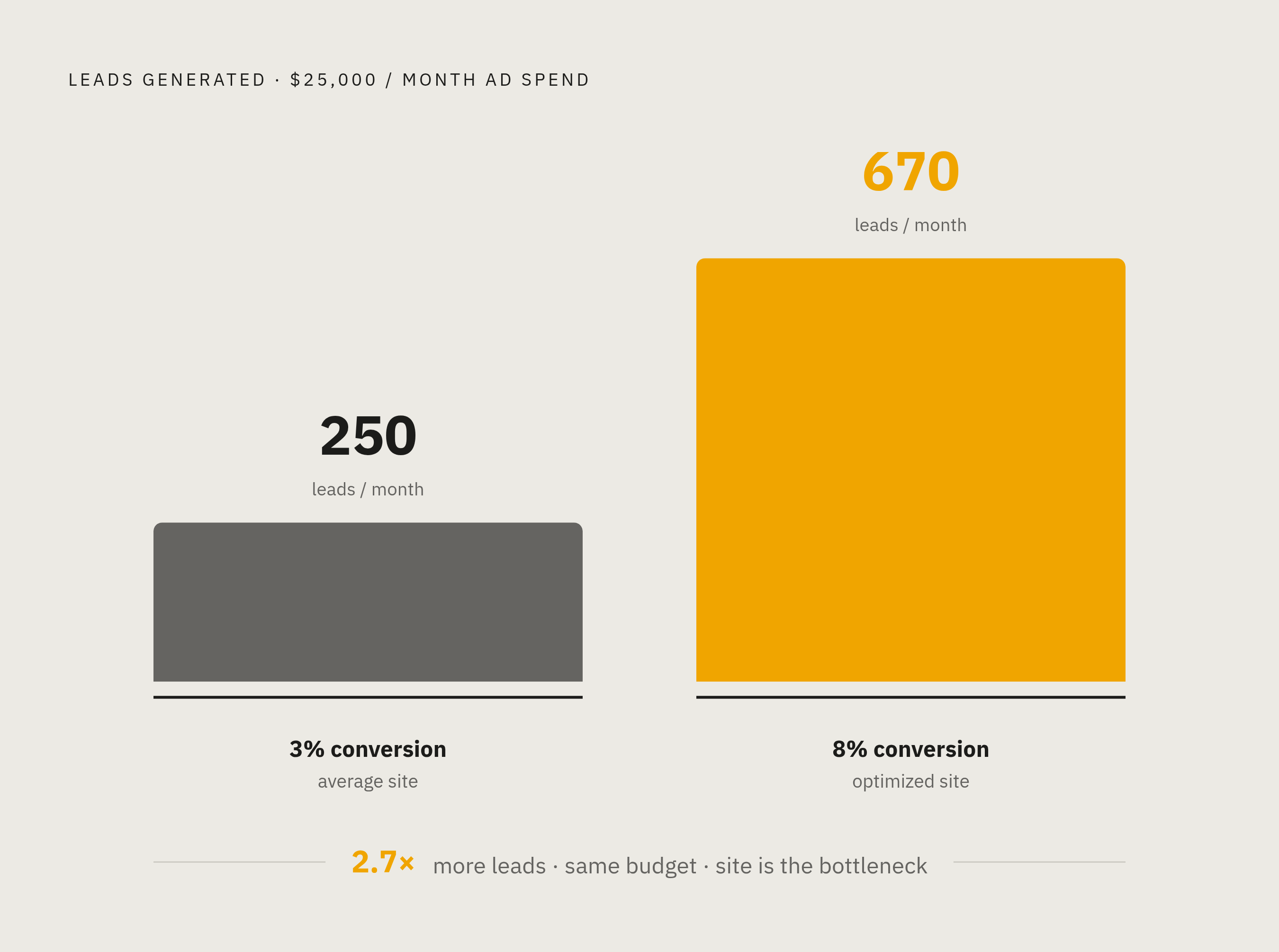
Put the numbers side by side and the pattern is hard to miss: average HVAC sites convert 2 to 3% of visitors, well-optimized sites reach 5 to 8%, and the best emergency pages hit 10 to 12% (HVAC SEO Agency, 2026). That spread is a multiplier sitting on top of every dollar already spent driving traffic to the site, which means the site itself, not the ad budget, is usually the real bottleneck.
Run the math and it gets concrete fast, per Astra Results' June 2026 figures. Twenty-five thousand dollars a month in paid traffic at a 3% conversion rate produces roughly 250 leads. The same spend at 8% conversion produces about 670, nearly 2.7 times the volume, without touching the ad budget at all. Apply a 25% close rate and a $700 average ticket to that gap and the revenue difference between an average site and an optimized one stops being theoretical.
Roughly 46% of HVAC conversions arrive by phone call rather than form submission (Web Tonic, 2026), which should end any lingering debate about whether the form or the phone number deserves top billing on the page. Call tracking data sharpens the picture further: emergency calls convert at 78%, averaging $1,247 per ticket, while maintenance calls convert at 34%, averaging $287 (HVAC Software Hub, 2026). That gap says something plain about where a site's design energy belongs. Every fold height, every form field, every button labeled "Call Now" instead of "Learn More" is either shortening the distance between a homeowner in crisis and a booked technician, or adding friction a competitor's site isn't. A contractor still arguing for the elegant contact form over the ugly, oversized call button hasn't looked at the close rates yet.
Sources
- HVAC Leads: Actionable Strategies for 2025
- 30 Best HVAC Company Website Examples 2026 - Colorlib
- HVAC Website Design: The Complete Guide for Contractors in 2026 - Nopio - World-class Web Design and Development
- HVAC Website Must-Haves: 12 Features That Generate Leads in 2026 — HVAC Software Hub
- 7 HVAC Marketing Strategies to Get More Leads in 2026
- HVAC Website Design: How to Build a Site That Converts [2026] - The HVAC SEO Agency
- astraresults.com
- bekindlocal.com


