Law Firm Website Design for Client Conversion
Distinguish lead captures, consultations, and signed clients—conflating them ruins your benchmarks.

Most discussions of "conversion rate" treat it as a single number. It is not. There are at least three distinct conversion events on a law firm website, and conflating them makes benchmarking nearly useless.
The first event is lead capture: a form submission or a phone call. The second is a booked consultation, meaning a qualified lead. The third is a signed client, the only event that generates revenue. These differ substantially in rate, and in what actually moves them.
The figures circulating in industry conversations reflect this fragmentation without acknowledging it. Unbounce's median conversion rate measures dedicated landing pages, not entire websites. WordStream's range applies to full-site conversion, stratified by firm size. First Page Sage's figure specifically measures SEO-sourced traffic. A firm benchmarking its site-wide rate against a landing page figure is comparing different things and either inventing a problem or missing the real one.
The more instructive signal is the spread within a single practice area. In disability law, individual page conversion rates range from under 1% to over 21%. That range exists across pages targeting the same audience, in the same legal vertical, often competing for the same keywords. Traffic quality cannot explain a gap that wide. Page-level decisions explain it: what the first viewport communicates, how the CTA is positioned, whether the form asks too many questions.
Traffic is visible and attributable. Page-level friction is quieter. It just costs you, consistently, without announcing itself. Measuring conversion without distinguishing which event you are tracking is like trying to weigh yourself on a clock — the instrument was never built for what you are asking it to do.
Before touching anything on the site, establish which conversion event you are tracking, on which pages, and against which baseline. Optimizing toward an ambiguous number produces optimistic dashboards and no additional clients.
How a prospective client actually moves through a law firm site before deciding to contact anyone
To understand why most law firm sites fail structurally, start with the person arriving, not the firm that built the site.
That person is rarely browsing casually. They are navigating a divorce, processing an injury, managing a criminal charge, or trying to protect a business they spent years building. They arrive skeptical, often having already read reviews elsewhere, and actively comparing firms before the homepage finishes loading.
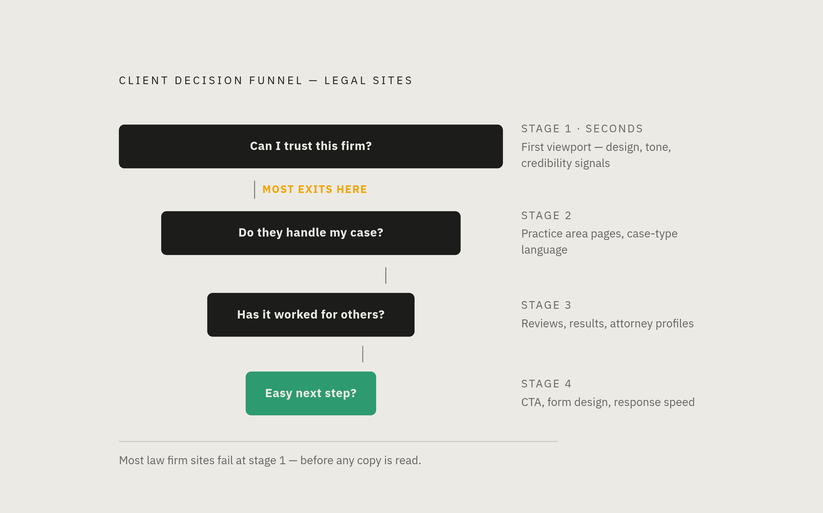
Given that context, the decision sequence is predictable. First: can I trust this firm enough to keep reading? Resolved in the first viewport, within seconds, before any substantial copy is processed. Second: do they handle my specific situation? Resolved by practice area pages and the specificity of case-type language. Third: has this worked for people like me? Resolved by reviews, case results, and attorney profiles. Fourth: is it easy to take the next step? Resolved by CTA placement, form design, and how quickly someone responds after submission.
Most law firm homepages answer none of these questions in that order. They open with a statement about the firm's history or values, present a list of practice areas with equal visual weight, then bury contact information in the footer. The implicit message is: here is what we want you to know about us. It is like a doctor walking into the examination room and spending the first ten minutes describing the décor. By the time the patient's symptoms come up, the trust has already left the building.
A person who just received a criminal summons is not shopping for brand affinity. They are looking for evidence that someone in this building can help them, and they will leave the moment that evidence is absent. Every structural recommendation that follows traces back to one of those four questions: at which stage is this specific element supposed to resolve doubt?
What the first viewport must communicate before a visitor decides whether to scroll
A Stanford Web Credibility Research study found that 75% of consumers judge a professional organization's credibility based solely on its digital presentation. That judgment happens before a single line of copy is consciously read. Which means the first viewport of a law firm website is not primarily a design problem. It is a trust problem dressed up as one.
What needs to be resolved is specific. The visitor needs to know who the firm serves and what problem it solves: not a tagline about commitment or results, but a direct statement of practice area and geography. They need confirmation that the firm is real, meaning a named attorney with a current photograph, not a stock image of a gavel or an empty mahogany conference room. They need to see that contact is easy, which means a phone number visible without opening a menu. And they need one clear next step, not three competing CTAs that distribute attention without directing it.
Trust signals earn their place in the first viewport when they are legible to legal consumers. Super Lawyers, Best Lawyers, and Martindale-Hubbell ratings are recognizable to someone who has already been researching firms on Google. A Google star rating aggregate belongs here too. Bar associations and court admissions are not. HTTPS and a visible privacy policy link matter at precisely this moment, because the visitor is about to share sensitive personal information, and anything that introduces doubt at that instant is friction.
What actively damages trust is equally specific. Rotating image sliders slow load times, are rarely interacted with, and degrade Core Web Vitals scores. Generic stock photography signals that no one thought carefully about this particular visitor. And the absence of a named attorney is among the most damaging elements: people hire lawyers, not firms. Anonymity in the first viewport does not read as professional restraint. It reads as evasion.
Run the A/B test on values messaging versus direct specificity. In my experience, specificity tends to outperform abstract credibility claims, particularly above the fold, particularly on mobile.
Why mobile is where most law firm conversion problems actually live
Mobile drives more traffic than desktop in the legal industry by a substantial margin, the largest channel gap Unbounce has observed across any industry it tracks. Over 60% of legal searches occur on mobile. And yet most law firm websites were designed on a desktop and then "checked" on mobile afterward, which is exactly backwards.
Google completed its migration to mobile-first indexing in 2024. The practical consequence is that the mobile version of a site determines search ranking. A mobile UX failure is simultaneously an SEO failure, which means firms are often paying for traffic they have already structurally committed to losing before anyone opens the site.
The load time data compounds the urgency. More than half of potential clients leave a site that takes more than three seconds to load on mobile. As load time climbs from one second to five, the probability of a visitor bouncing increases 90%, per Google's own research. Portent found that a site loading in one second achieves conversion rates three times higher than the same site at five seconds. Few design choices on a law firm website matter more than whether the page loads.
The subtler problem is that many sites technically "work" on mobile while still failing conversion. Buttons sized for a cursor rather than a thumb. Contact forms demanding a dozen fields on a four-inch screen. CTAs positioned several content blocks below the fold, requiring scroll behavior that most mobile visitors in a stressed decision state simply will not perform. Trust signals that appear prominently on the desktop layout but fall below the fold on mobile entirely, as if they were hidden as a courtesy to the competition.
Mobile-first is not a technical preference. It is the correct starting point: design the mobile experience first, then adapt for desktop. The mobile-to-intake pipeline is precisely where the conversion gap opens, and it opens quietly, because the firm never sees the people who left.
How navigation structure and CTA design either guide visitors toward contact or scatter them
There is a principle in legal UX that visitors should be able to reach practice area detail, attorney credentials, and a contact method within three clicks from any page. The reason it matters more in legal than in, say, e-commerce, is that legal visitors do not browse patiently. They are researching under stress, often on a deadline imposed by a statute of limitations or a court date. The site's navigational architecture either acknowledges that reality or it doesn't.
Practice area pages deserve particular attention because they are where visitor identification happens. A page about FMCSA regulations and trucking accident liability will outperform a generic personal injury page for someone searching "Houston truck accident lawyer," not because it is longer, but because it uses the specific language that matches the visitor's situation. The visitor needs to encounter language that makes them think: this is exactly my situation. That recognition is among the strongest conversion signals in legal UX.
CTA design follows the same logic of reduction. Pages with a single focused CTA consistently outperform those with competing calls to action. Phone numbers, email addresses, and physical addresses belong in every header and footer, not only on the contact page. Each additional required field on a contact form is a discrete abandonment opportunity. Every unnecessary form field is a door the firm closes on its own visitor.
One concrete example: a homepage had four identifiable failures. No practice-area headline visible above the fold. Phone number absent on mobile. Contact form at the bottom of the page. Low-quality attorney photography. After correcting all four, bounce rate dropped to 41% and consultation requests increased 140% without any change in traffic volume. The traffic was already there. The conversion failure was entirely architectural.
How attorney profile pages and social proof convert skeptical visitors into callers
At some point in the research process, most prospective clients navigate to the attorney bio page. This is where the decision often tips, and the gap between how firms think about the page and how clients actually use it is most pronounced. Firms treat the bio as a curriculum vitae. Prospective clients use it as a trust verification step. Those are different documents.
A conversion-oriented attorney profile does several things a CV does not. It includes professional photography that is current and specific, not a headshot from 2014. It lists bar admission numbers and court admissions in a form that allows independent verification, because a visitor who is skeptical will check, and finding that information readily available actually reassures them rather than feeling intrusive. It includes named case results or representative matters where bar rules permit, because outcomes are what a prospective client is actually evaluating.
The brief human element matters more than most attorneys are comfortable admitting. A paragraph explaining why this attorney chose this practice area gives the visitor a person to hire rather than a credential set to evaluate. That is not sentimental; it is functional. High-stakes decisions are made with emotional inputs alongside rational ones, and the profile page is where that dynamic is most legible.
Review placement follows the same logic. If the overwhelming majority of potential clients read reviews before hiring, then forcing them to navigate away from the site to find those reviews is a decision to lose control of a critical part of the conversion process. Reviews belong on the site, proximate to the profile they corroborate. "Helped me through my custody case in a situation I thought was hopeless" tells the next visitor something specific and emotionally resonant in a way that a star aggregate cannot.
It is also worth considering what this means for search. Google applies heightened scrutiny to legal content under its YMYL framework, and named attorneys with visible credentials, active bar registrations, and real review volume are among the strongest trust signals a legal site can carry. A weak bio page underperforms in two directions simultaneously: it fails to convert visitors, and it suppresses the ranking that would have brought more of them.
Where leads go after a visitor submits a form — and why most firms lose them there
Roughly a third of calls to small and mid-sized law firms go unanswered during business hours. The mechanisms are entirely mundane: a receptionist at lunch, a phone system with no overflow routing, an attorney in a deposition with no coverage. Nothing dramatic. Just an ordinary Tuesday afternoon, and the lead is gone.
The email response data is similarly difficult to rationalize. Only a third of firms respond to emails from prospective clients, and that figure has been declining. The trend is moving in the wrong direction, quietly, because no one sends a firm an email to tell them they hired someone else.
The urgency profile of a legal inquiry is different from most service categories. Firms that respond within five minutes see substantially higher conversion rates than those that respond later. Approximately 80% of legal consumers move on to another firm if they receive no response within 48 hours. The visitor has already told you they are comparison shopping; most of them will contact multiple firms before making a decision. Response speed is how you end that comparison before it ends you.
I once spoke with a firm administrator who described their intake process as "we get back to people when we can." They had spent over $200,000 on digital advertising that year. The front-end investment was serious. The back-end assumption — that leads would wait — was costing them a substantial share of what they had paid to attract.
The median law firm response time to online leads has improved meaningfully in recent years, but even the current median sits above the threshold where conversion rate gains are steepest. And the distribution has a long tail. The firms anchoring that tail are not failing because of bad marketing. They are failing because a well-designed site drove a form submission, and then an ordinary Tuesday happened.
The front end earns the lead. The back end decides whether the firm keeps it.
What automated intake tools can and can't do for law firm conversion
A substantial portion of prospects abandon contact forms without completing them. The intake problem starts earlier than most firms realize, which means solving it only at the response stage is already a partial fix.
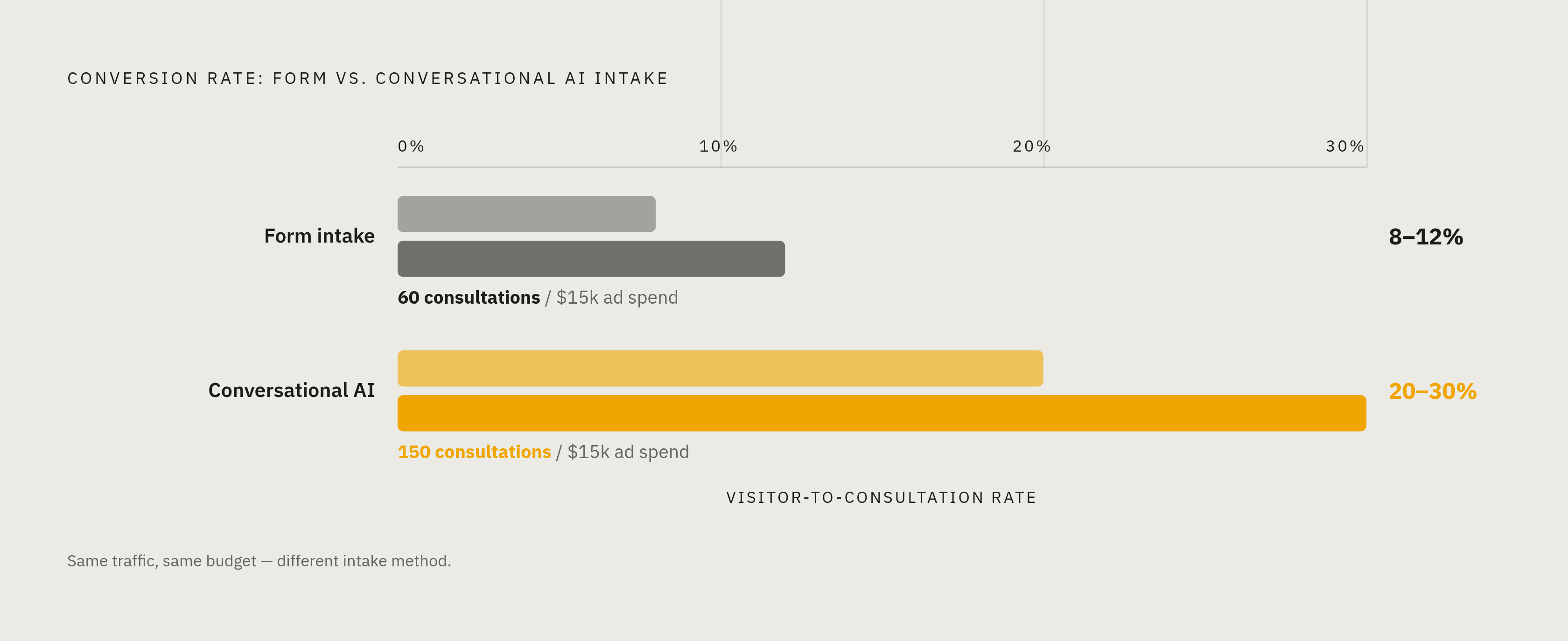
The conversion differential between intake methods is meaningful. Form-based intake converts visitors to consultations at roughly 8% to 12%. Conversational AI intake pushes that range to 20% to 30%, according to research drawing on legal consumer data. For a firm spending $15,000 per month on Google Ads, that difference represents roughly the gap between 60 consultations and 150 from the same budget. Round-the-clock intake solutions combining chat and phone availability tend to generate more signed cases from identical traffic volumes.
But automated intake creates genuine failure modes that are easy to understate when aggregate conversion numbers look good. A chatbot cannot assess emotional urgency or sensitivity. A prospective client in a domestic violence situation, calling from a shared device, possibly frightened, needs a human response. A scheduling link is not a neutral alternative; it drives that person away entirely. Chatbots can also misinterpret legal terminology and produce responses that are vague, misleading, or potentially problematic from a professional responsibility standpoint. High-value clients with complex commercial matters or serious personal injury claims sometimes abandon a chatbot-only experience as impersonal, and the channel mismatch costs the firm precisely the leads it most wanted to capture.
These are not necessarily edge cases correctable with better chatbot training and more careful routing logic. If automation improves conversion rates on average while degrading conversion quality at the high-value end, the firm needs to decide explicitly what it is optimizing for before deploying it. That is not a technology question. It is a business strategy question wearing a technology question's clothes.
The intake architecture that holds up combines automation for availability and triage with human capacity for the interactions where it matters most. A firm that routes every visitor through a chatbot, captures more leads overall, and loses the high-value clients who wanted a human and found only a bot has optimized for a metric that looked good in the report and cost them in the close.